Adds new Date Picker input component and improves Grid.
Features
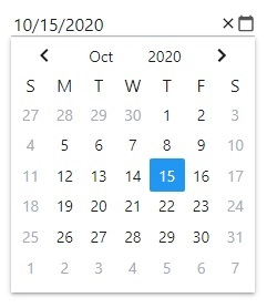
- Added new React Date Picker input component - Allows end-users to select a date from a calendar that is shown in a dropdown when the editor is clicked and adds the ability to navigate the days, months, and years in an intuitive and easy to use component.
- Improved React Grid.
- Accessibility (ARIA) - Added the appropriate ARIA attributes to all grid DOM elements which are required for screen readers to interpret and interact with grid-based applications.
- Added Row Editing - You can now edit an entire row and make changes to other cells in the same row without committing the data, with the ability to use undo capabilities. Cell values that have not been committed are visually represented by a light gray italic text styling.
- Added new React Multi-Column Combo Box - It is a combo box that visualizes large amounts of data in a data grid embedded in the dropdown and supports features such as filtering with auto-suggest, a material-based label, placeholder text, defining columns, controlling column header visibility, sorting, and more.